Redesigning Solution
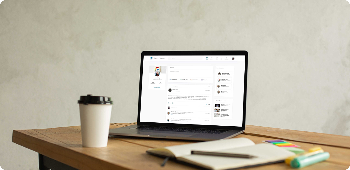
Redesigning LinkedIn
Professional networking platform designed to connect individuals, businesses, and organizations for career development, job opportunities, and professional growth.
Role
UX UI Designer
Duration
6 months
Tools Used
Figma, Maze
The process
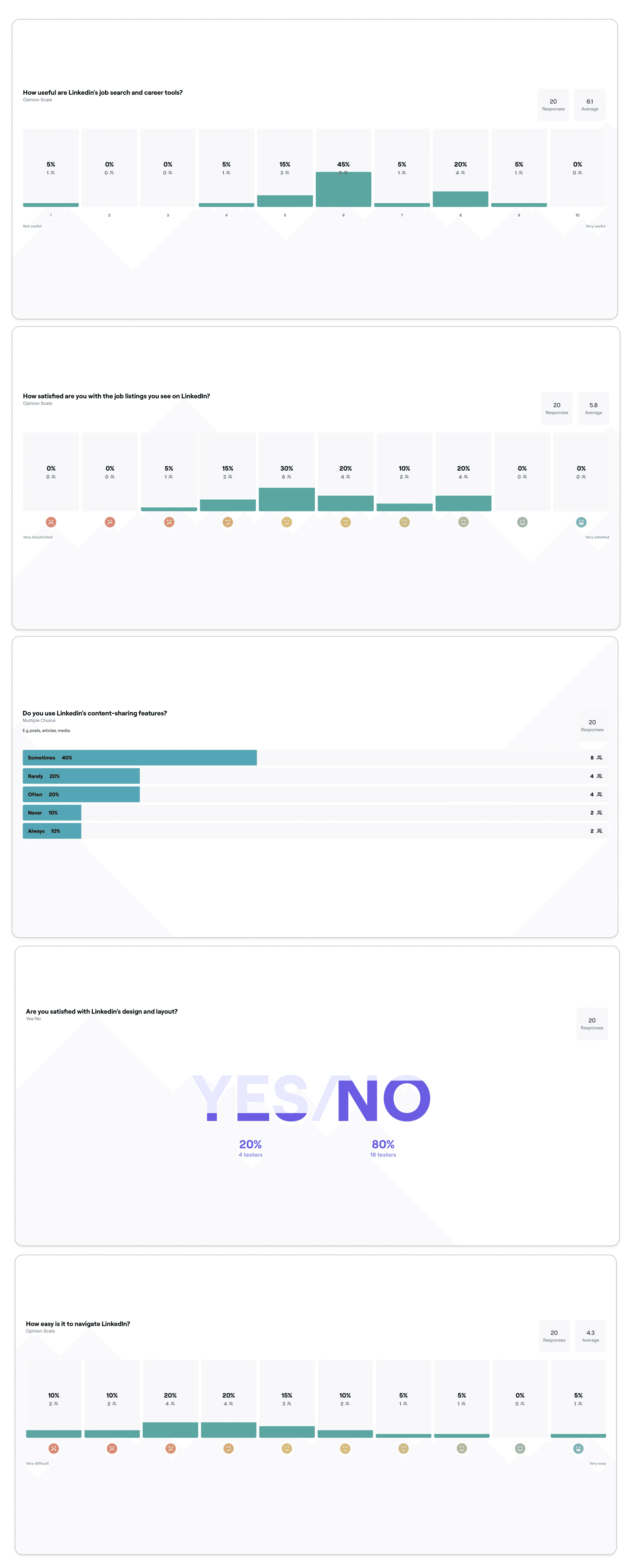
To gather feedback on Linkedin's web experience, I conducted a survey to understand pain points and satisfaction levels.
I shared the survey with my LinkedIn network, inviting users to provide open-ended feedback and close-ended responses.
After distributing the survey to my connections, I received responses from 20 users.
This provided me with valuable insights and allowed me to identify areas for potential improvement in Linkedin's interface.
Defining the goal
• Focus on highlighting key features that are most important and frequently used by users, ensuring they are easily accessible at all times.
• Streamline the user interface to create a clean, visually appealing layout that feels light on the eyes and avoids overwhelming users with unnecessary elements.
• Refine the color scheme to align with LinkedIn’s branding, using a balance of calm, neutral tones with subtle, strategic accent colors to guide user attention and enhance readability.
• Organize content clearly with well-defined categories and intuitive navigation, making it easy for users to find what they're looking for and feel confident in where to go next.
• Enhance the overall look and feel of the platform, focusing on creating an enjoyable, seamless experience that encourages users to stay, explore, and engage with the community.
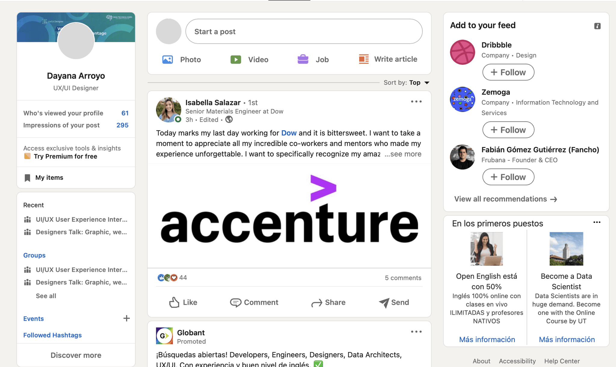
Before/Feed
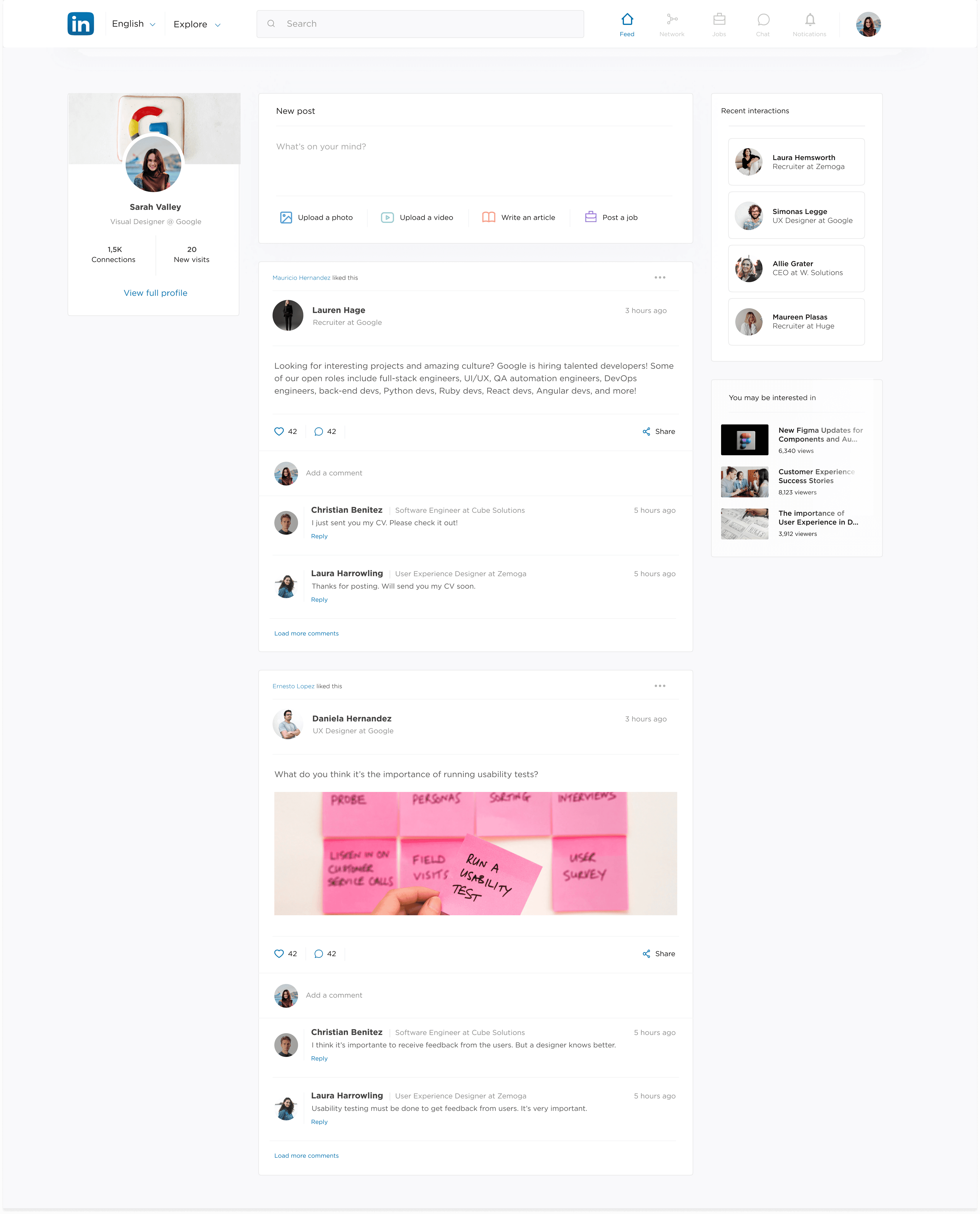
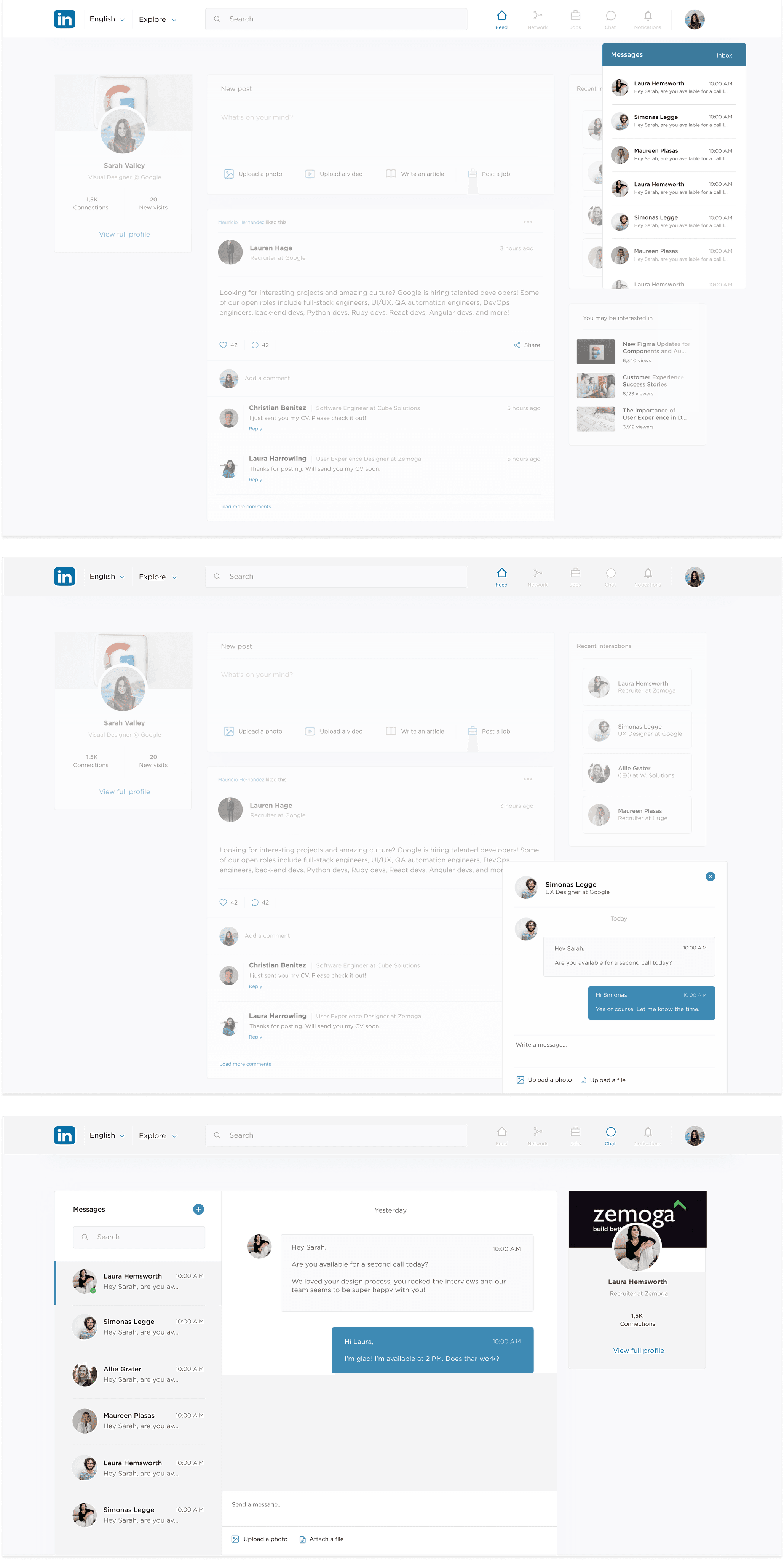
The navigation experience in the feed section has been streamlined. Currently, there are too many buttons, which can overwhelm users and create a cluttered, visually heavy interface. The new design simplifies the layout, reducing visual noise while ensuring that key actions remain prominent and easily accessible. This makes the interface more intuitive, so users can quickly understand what to do without feeling overwhelmed.
After/Feed
Search for people, companies and groups
In the current design, recent searches are displayed, but the search function lacks clear category organization. The redesigned interface aims to provide a more organized and intuitive search experience by categorizing results into clear sections such as people, companies, and groups making it easier for users to find what they're looking for at a glance.
Network
The network section still offers the same functionalities, but the redesign offers way less weight to the eye.

Jobs
In the current LinkedIn design, some options on the left- hand sidebar are not yet available. For the redesign of the Jobs section, we've identified a more prominent placement for "Recent Job Searches" and repositioned the "Post a Job" button to a more visible and accessible location, addressing its current placement lower on the page, which diminishes its visibility and importance.
Profile
In the redesigned profile section, the interface has been streamlined by organizing key information into clear categories. In the current LinkedIn design, users with detailed profiles often have to scroll extensively to find relevant sections. To improve this, we've divided the profile into distinct categories such as: About, Activity, Interests, and Awards. This makes it easier for users to navigate and access the information they need.
Profile for companies
Messaging
Learnings
While this is not LinkedIn's official design, the proposed redesign focuses on creating a cleaner, more intuitive user interface that aligns with user feedback and preferences.
If LinkedIn were to adopt this design in the future, users would likely embrace it for its simplicity, improved navigation, and enhanced user experience.